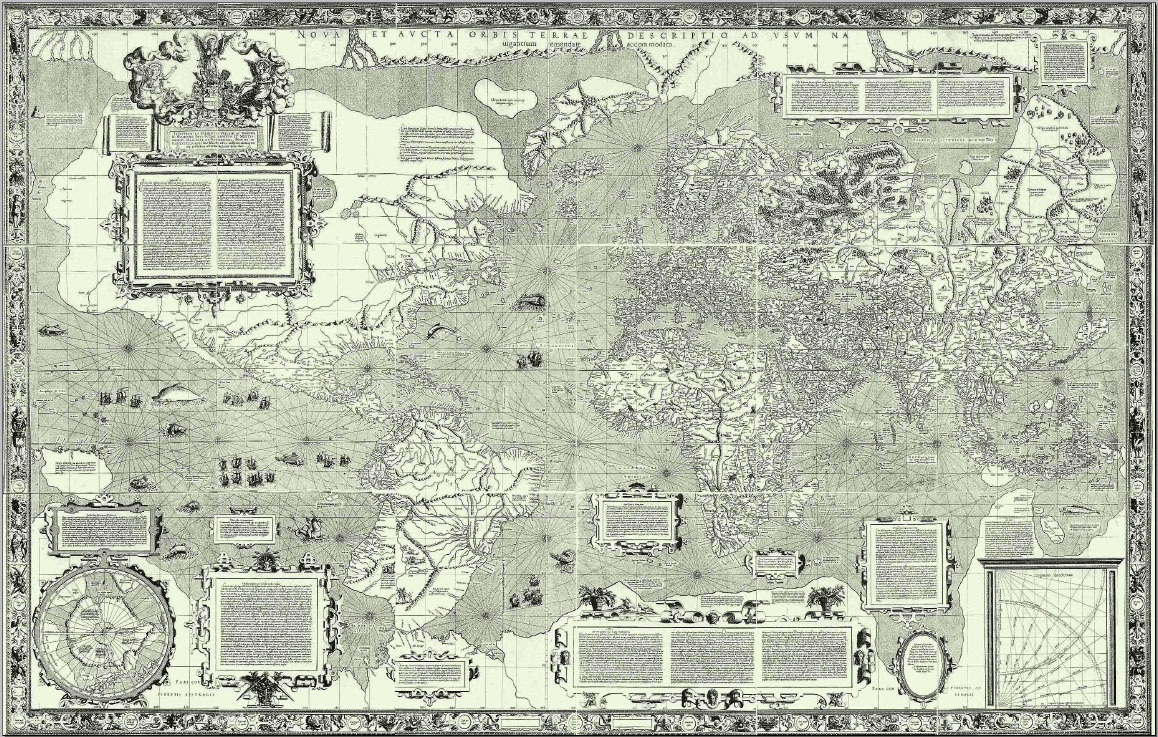
We are all familiar with the Mercator map of the world, designed by Gerardus Mercator in 1569. At the time, it was a significant cartographic breakthrough: a representation of the spherical earth on a plane. But we are all equally familiar with the fact that the Mercator map seriously distorts the actual size of various land masses (notably Greenland). Visual Capitalist offers an interesting graphic which shows how significant this distortion actually is and diminishes the land masses in the north and more accurately shows the size of the continent of Africa.
The Original Mercator Map

The Visual Capitalist Correction
A new study from the University of Hawaii has reviewed thousands of peer-reviewed climate studies and analyzed the different ways climate change poses threats to humanity. The study came up with “467 ways in which human health, food, water, economy, infrastructure, and security have been impacted by multiple climatic changes including: warming, drought, heatwaves, wildfires, precipitation, floods, storms, sea level rise and changes in land cover and ocean chemistry.” Different regions of the world will experience different threats, but the study is the first to examine all possible impacts. The map below shows some of the impacts and how they will have differential effects.


Leave a comment