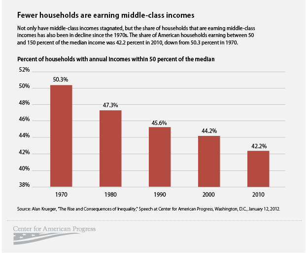
As we move toward another political convention (the Democrats this time), we’ll be hearing lots of rhetoric about the American middle class. It is a crucially important issue, and Barry Ritholz, one of the savviest economic bloggers around, has a great post on the status of the middle class. Here’s one of his graphs:
After nearly four decades of violence, the Colombian government has announced that it is starting peace talks with a rebel group known as the Revolutionary Armed Forces of Colombia (FARC). The bloodshed in Colombia, fueled by ethnic animosity, economic inequality, and drug money, has been unremitting and horrific. It’s too soon to make any predictions, but it appears as if both sides have decided that they are invested in negotiations over a very long term–itself a hopeful sign.
The Economist published this chart on global arms sales in its 3 September 2012 edition. A very revealing graphic.


Not to be argumentative, but that first chart about the middle class is a bit skewed. At first glance you can’t help but agree that gosh, the middle class has disappeared. However, if you look more carefully, you will notice that there has only been an 8.1% change over the course of 40 years. That is a .2% change a year, which is not as drastic as that chart makes it seems. Additionally, the chart completely negates to say whether this 8.1% change has been the middle class earning more or the middle class earning less than the median income.
LikeLike
One doesn’t have to apologize for raising questions on this blog–every point is contestable and we should all welcome good and intelligent questions.
The chart is indeed skewed: it only shows the percentages from 38-52% which accentuates the appearance of change. One would have hoped for a graph that showed 0-100%; such a graph would have shown the change in the appropriate perspective. The question of whether an 8.1% decline in the number of households with annual incomes within 50% of the median over the last 40 years is “drastic” really depends on what one expects as an economy grows (which the US economy unquestionably did). The US GDP in 1970 was about $1 trillion; in 2010 it was about $14 trillion (http://www.usgovernmentspending.com/spending_chart_1970_2010USb_11s1li011lcn__US_Gross_Domestic_Product_GDP_History)
So wealth increased by 14 times in those 40 years. Does economic theory suggest that under such circumstances the percentage of households taking a share in that wealth creation should increase or decrease?
Your second point is entirely valid. Since the graph only shows the median, it tells us nothing about what the actual incomes of the “middle class” did in those 40 years. The link to Ritholtz’s post, however, does give us some data on actual incomes. Unfortunately, he only gives data from 2000-2010 so we can’t make a direct comparison. But median household income went from about $53,000 in 2000 to $49,445 in 2010 (in 2010 dollars). So we can assert that the middle class was in fact earning less from 2000-2010, although we cannot make that assertion about 1970-2010.
Thanks for your comment.
LikeLike