The United Nations, and many other organizations and countries, have used the 16th century Mercator map of the world for an extended period of time. However, as most people are aware, the Mercator projection artificially enlarges the land near the poles and reduces the size of lands near the Equator. So the UN has voted to start using a different map which reduces that distortion.
Greenland loses space on the map, but Africa gains a lot of space, and its size is more accurately portrayed as the images below show.
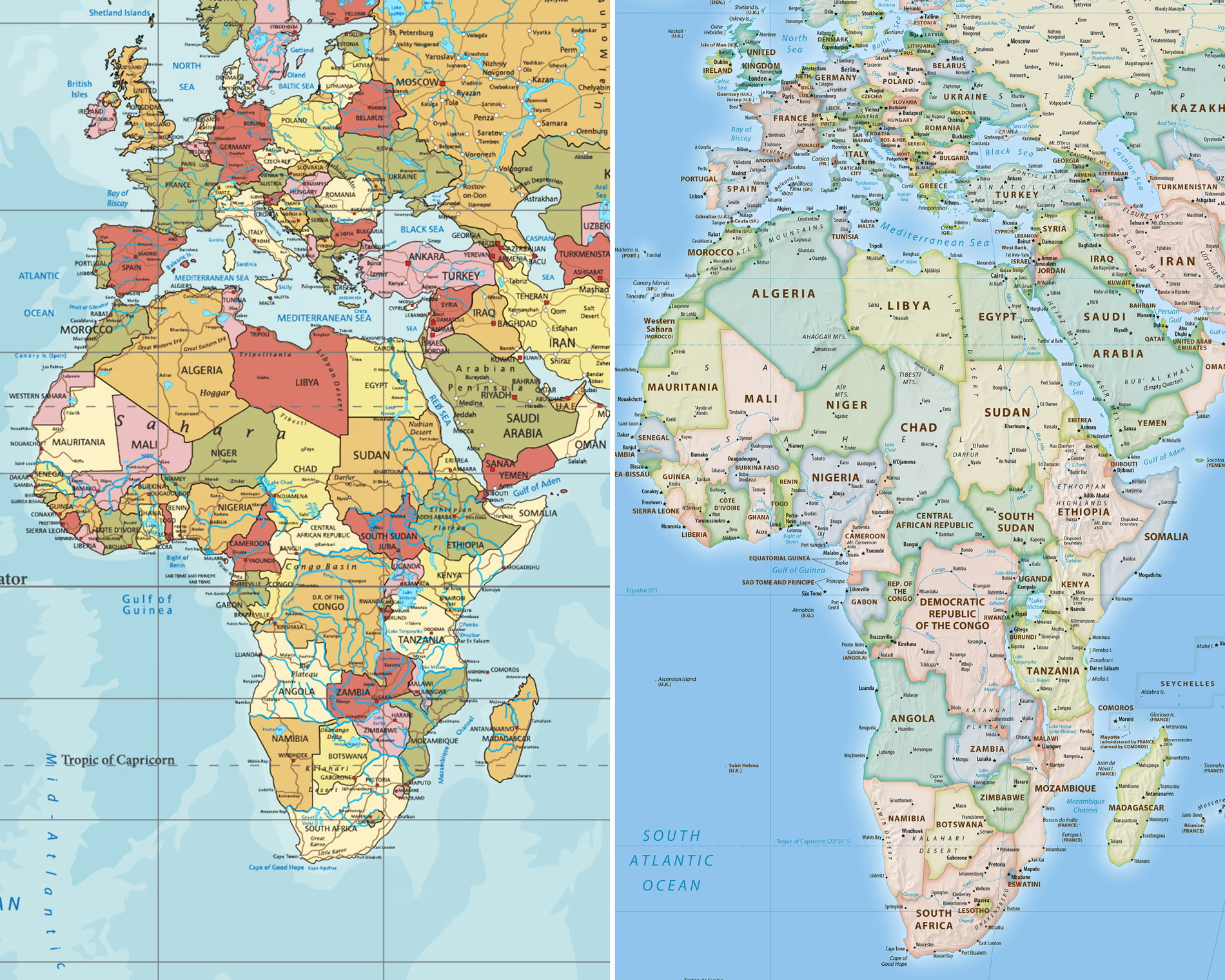
Delegates to the UN adopted the new map because it more accurately portrays land mass in a way that enhances the significance of equatorial regions. The Guardian explains the importance of the change:
“Some argue that the map has subtly shaped international power dynamics by minimising the physical presence of the global south and visually inflating northern hemisphere nations while shrinking equatorial regions. This is said to have reinforced systemic biases in international trade, development priorities and educational frameworks.”
The vote in the UN was nearly unanimous–only the US voted against the change. According to The New York Times, the US objection to the map was ideological: “The only nation that voted against the resolution was the United States, which said the map promoted an “ideological agenda” and was a distraction from the “genuine problems of international peace, prosperity or good relations.” Apparently, size, not accuracy, is the most important issue for the US.


Leave a Reply